BLACKWOOD PROJECTS
Brand Identity / Visual System / Foundations for Growth
Reframing an established construction business for its next phase of growth.
The Challenge
Blackwood Projects was an established premium construction company undergoing a name change and brand repositioning. While the business had a strong reputation and proven capability, the existing brand no longer reflected the level of work being delivered or the direction the company was heading.
The challenge was not awareness, but alignment.
The new name needed to carry the weight of the company’s experience while signalling a more refined, considered, and future focused position. This was a business already trusted within its market, but the brand did not fully support that trust when viewed by new clients, partners, or consultants encountering it for the first time.
The risk with rebranding an established business is disruption. The identity needed to evolve without eroding confidence or disconnecting from the company’s track record.
The question was how to introduce a new name and brand that felt like a natural progression, not a reset.
The Approach
The solution focused on clarity, continuity, and confidence.
We began by defining what needed to stay consistent and what needed to change. The brand strategy anchored the new identity in the company’s existing strengths, quality of work, and positioning within the premium construction space, while allowing the business to step forward with a clearer and more deliberate presence.
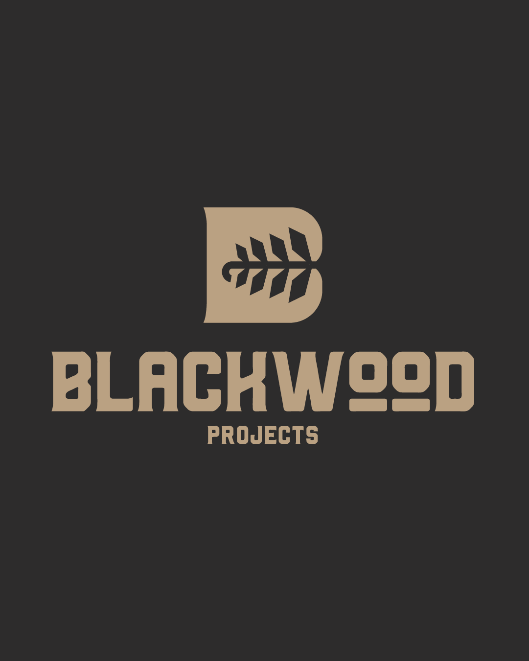
The visual identity was designed to feel assured and timeless rather than trend driven. The logo system balanced strength and restraint, signalling capability without overstatement. Typography, colour, and layout choices were made to reflect precision, care, and professionalism, qualities already present in the work itself.
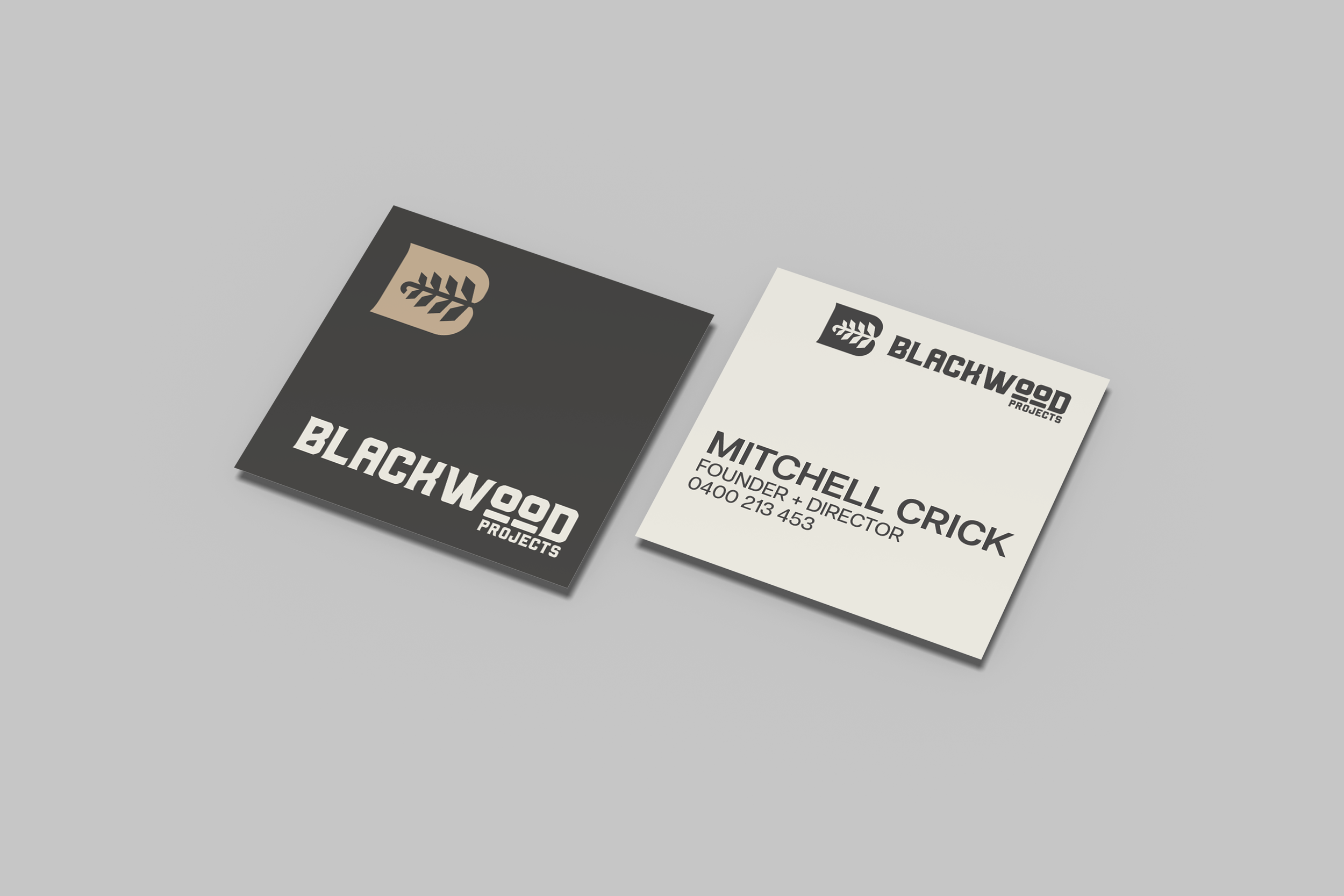
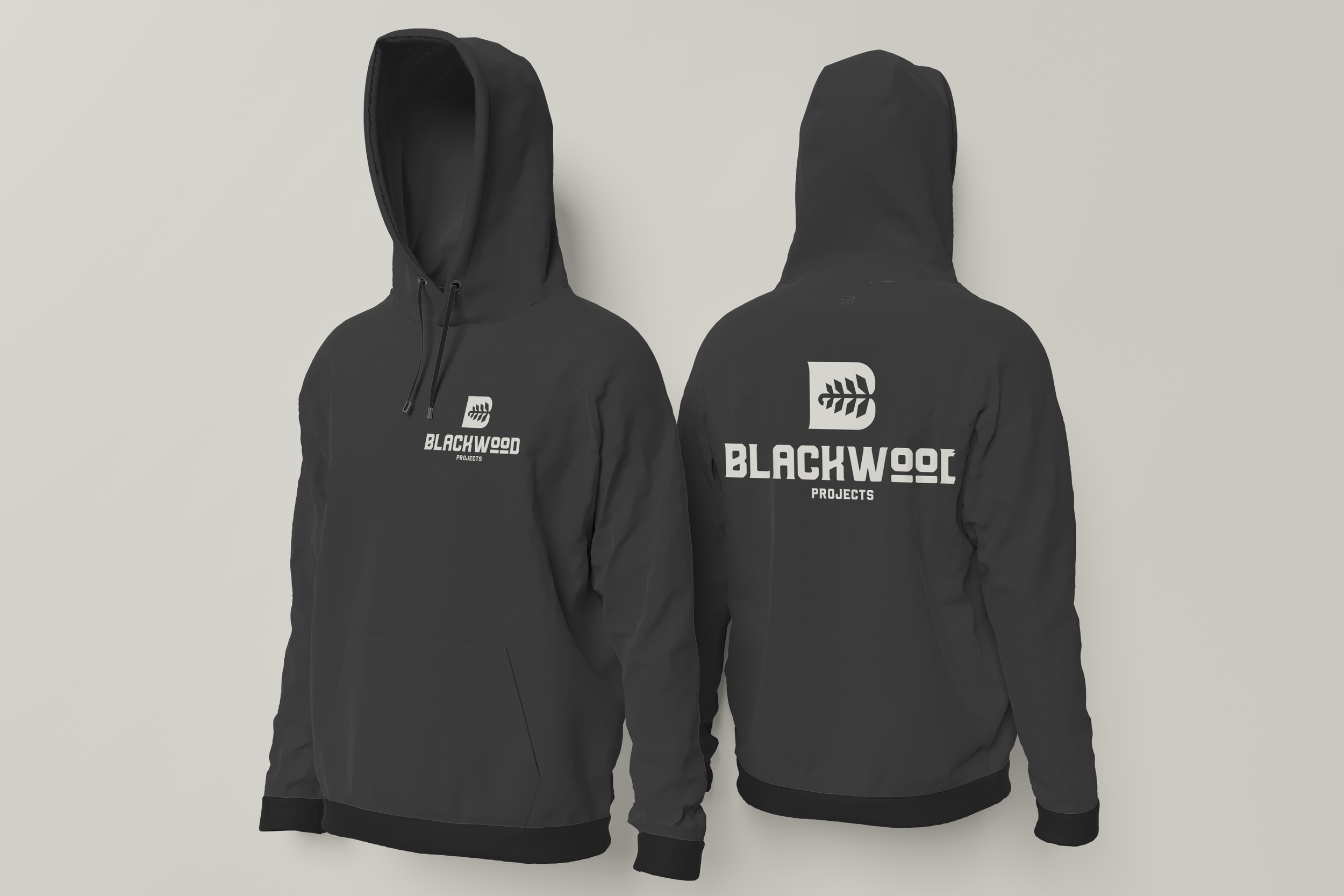
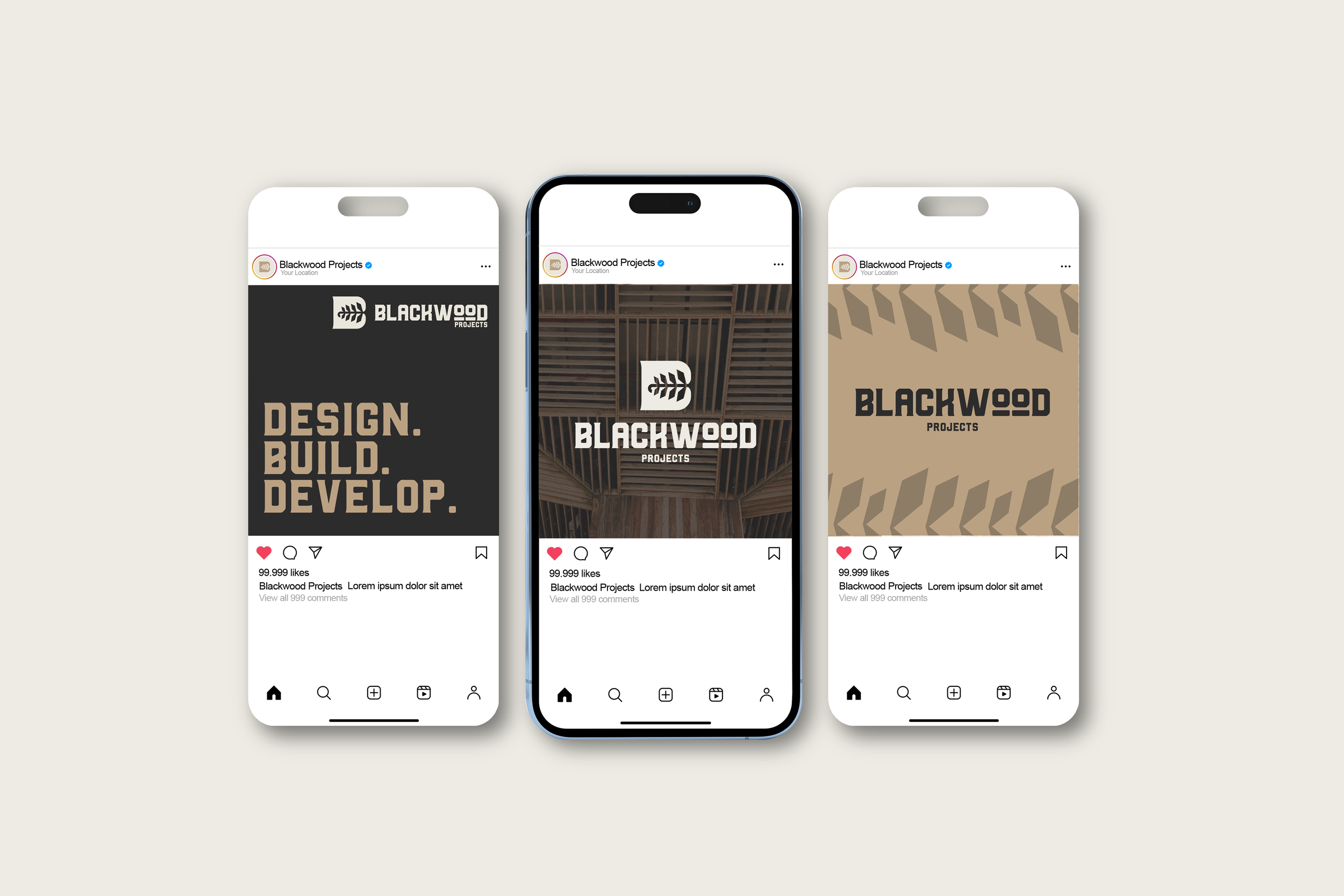
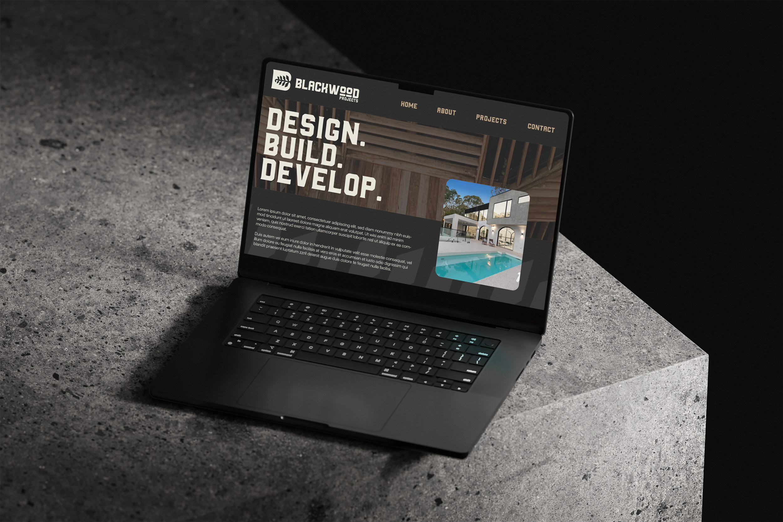
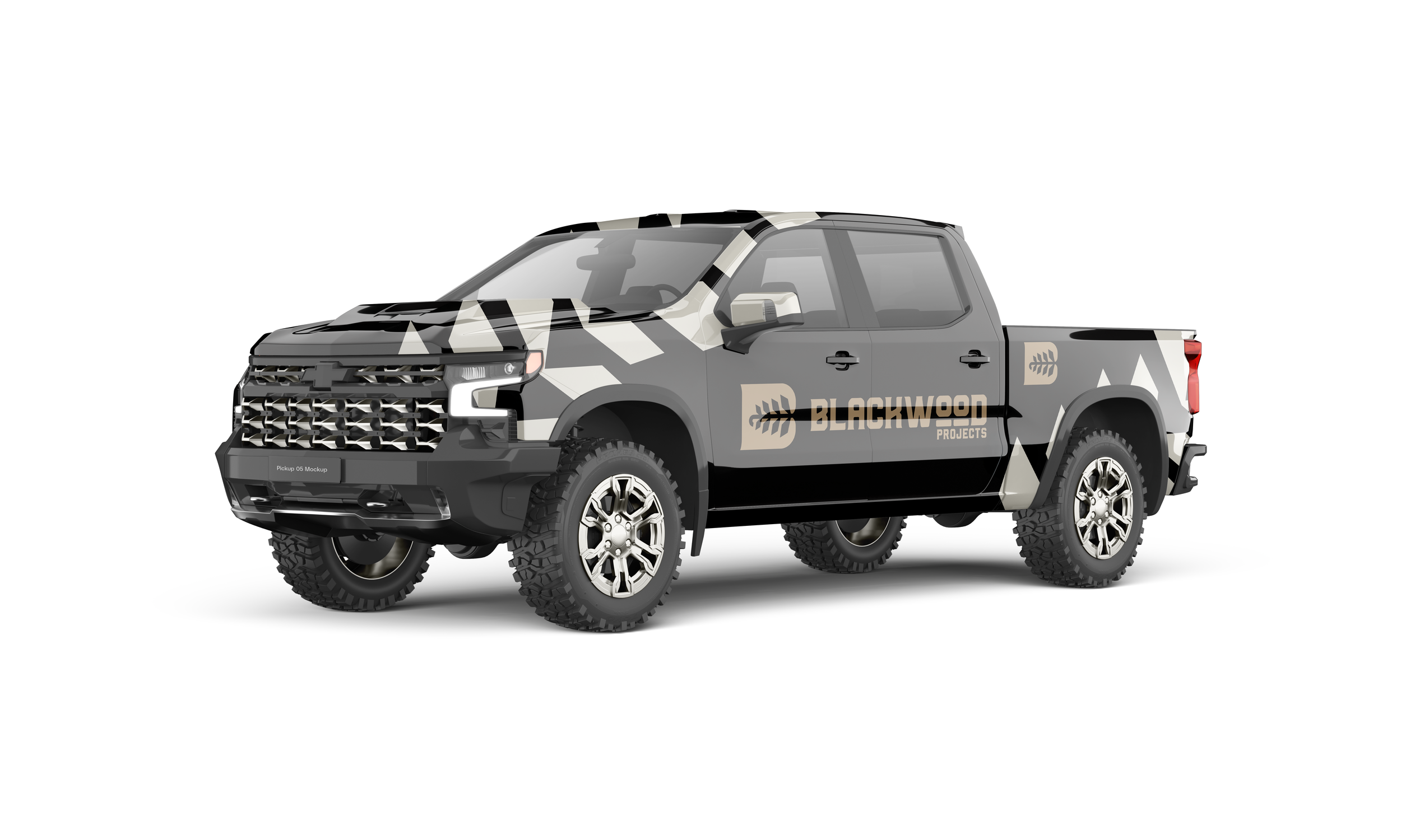
Crucially, the brand was built as a system rather than a single mark. This ensured the new identity could be applied consistently across signage, documentation, digital touchpoints, and site environments, reinforcing trust at every interaction.
The result was a rebrand that felt familiar to existing relationships while clearly communicating evolution and intent to new audiences.
The Results
A clear and confident brand aligned with the company’s premium positioning
A smooth transition to a new name without loss of trust or recognition
A consistent visual system reinforcing credibility across all touchpoints
70% of enquiries converting into paid work as a direct result of increased clarity and confidence
